What is good design?
Is there really such a thing, and how might we achieve it?

I wonder have you ever walked down the street or flicked on your television and, looking at a particular advert or promotion, made the comment “Oh, that’s a bad design!”
For the most part, we just mean that we don’t like how that particular thing looks, and in that sense, we all have our own opinion of what makes “good design” and what doesn’t. It does however highlight a bit of a problem for any designer, promoter (or indeed consumer), because if each person has a different opinion on what looks good, and that is how a good design is defined, can any design ever be universally good?
I believe that there is in fact a universal definition of good design, but perhaps this attitude of ranking designs by what we like (or don't) has things a little bit backwards. If we start with the wrong conclusion, we will always find it difficult to move our own designs and our brands forward. We end up copying others and seeing little success in our products and in our marketing. So, being in the eternal pursuit of that perfect design solution, the question I wanted to take a quick look at today is this…
Is there really such a thing as ‘good’ design, and if so, how can we continually achieve it?
Perhaps the best place to start to answer that is with the most fundamental (albeit obvious) question…
What is design?
When I was in school, the subject which I most enjoyed was called ‘Art and Design’. Most folks just referred to it as “Art” of course, but believe it or not, there was actually a reason for the two-part name (I can tell you’re shocked). It was about the important distinction between what we define as ‘art’ and what we call ‘design’, for by definition, one is about form (art), while the other is about function (design), or in yet more words, art is about how something looks and what it expresses, while design is about how it works and what it says.
That means that for those of us in a design profession, our job is *supposedly* to create something that puts across a certain message, or has some kind of function besides just looking cool. That means that anything a designer makes –whether fashion, product, graphic or otherwise– is meant to fulfil a specific purpose, and this is why we get to call ourselves ‘designers’ (otherwise I’d be a graphic artist which is an awesome but totally different thing).

The quality of a particular design would then properly be defined, rather than something that just looks good, as something which does its job well. Let’s have a quick sidestep and look at the example of the anglerfish (see the image – and yes it is in fact a real creature, not just a scene in Finding Nemo). The anglerfish is without a doubt one of the most horrible looking creatures in all of creation, but it is a perfect example of function before form. It attracts prey with its little hanging light, and when another fish comes close, its nasty extended jaws snap swiftly upwards to catch its prey. You only need to look at the shape of it to know that it has adapted into a perfect predator – Horrible, yes. But perfectly efficient. An excellent design, albeit a nasty appearance.
Back then to what merits as “good design” – if design is really about function, surely it can only be properly valued on how it fulfils its purpose, rather than how it looks.
So “good design” shouldn’t look nice?
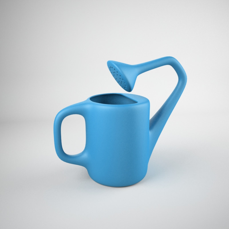
Yes, and also no. If design is primarily about function (we’ve already said it should be), a good design is one which makes function its most important aspect and does it super well – whether that’s a comfortable and well-proportioned chair, or a clearly presented poster. A good design would never be bad at what it is meant to do.
So that might be the surface truth, but if we look a bit further we see that just because a design puts function first, that doesn’t mean it can’t also be visually stunning.
To expand my previous examples, a poster’s main function might be to convey information, but it’s also meant to catch a person’s attention, and inspire them to some form of action. A good chair should be comfortable, but it also has to look good in a consumer’s home or it won’t be purchased.
More often than not, an object’s function will in fact include some requirement for it to look nice, and in those cases, a good designer should always look for the best balance between utility and visual impact, all the while remembering that the way something looks should never be more important than achieving its purpose.
What does that all mean for you and your project?
Probably not a whole lot, but perhaps it can be summed up by this – Creating the best design, and being at the cutting edge, is less about going with the crowd, and much more about producing the simplest and best functioning product, and then making it look great.
We’ve gone wrong somewhere along the way if a project looks really good, but is really hard to understand or unpleasant to use, or indeed if it has all the right parts but people aren’t going to look twice at, so here is my advice. Don’t fill up every space with too much information. Don’t try out too many different ideas at once. Instead, really think out what your audience might need to know or what would interest them. Take that content, simplify it ruthlessly, and once you have the best content possible, why not start up a conversation about how we can put that information across in the most creative and jaw-dropping way possible.
As Leonardo Da Vinci once said,
“Simplicity is the ultimate sophistication,”
and this is so true of design, because the best designs are truly clear and simple – fulfilling their purpose, and looking good while doing it.
A foregone conclusion?
It does seem that everyone on the street has their own opinions on what merits the prestigious badge of “good design”, but in the end of the day, design probably shouldn’t be quite so subjective. It shouldn’t really be about personal taste or current trends, but rather how successful that product is in doing what it set out to do.
That particular TV advert might make you cringe, but does it help you to remember the brand it represents at a crucial moment? Perhaps the poster for that funky new café looks wonderful and modern, but did you have to turn it upside down and read it 3 times to work out what it was trying to say? Did it help you to understand what the café does or where you might find it?
“Good design” is about so much more than how something looks, so for your next project, how about we throw out the old ideas and try to make something really good … or maybe even great.
Thanks for stopping by!


