Creating our new brand
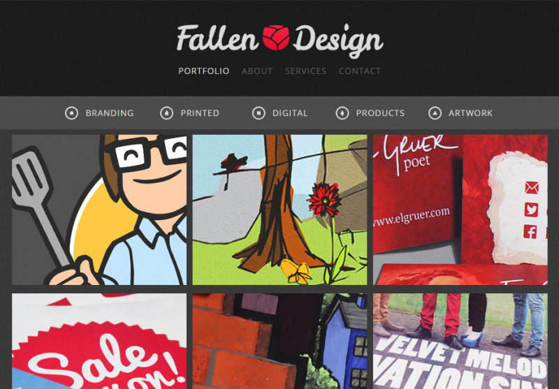
It was January 2012, and I had just begun to explore the possibilities of freelance work when I first set up a small design company called Fallen Design. At that time, it was mostly an experiment to see if I could even run a business, but it turned out that being a designer was actually a lot of fun!
Very soon, things started to move much more quickly.
After a few years, things had really started to fall into place for Fallen Design, and it was clear that a refresh of the company was the best thing that we could do to move forward. Our initial structure had been a great starting point, but as the possibilities grew and flourished, I decided that so too must the brand.
So now the only question was how to go about it...
Choosing a new name
For this rebrand, I was going to take no prisoners. “Knock it all down and start again” was the cry, so I decided that the first thing to change would be the name – a new name for a new chapter.
The name of a business is a hugely important part of any brand. After all, it’s the word (or words) that people use when they talk about you out in the world. The very best brands over the years have made their name synonymous with their product or service (think JCB, Hoover, Biro or –depending on your pronunciation– Duck® tape), and many well-known names can instill a feeling of assurance and quality. Google’s brand name was even so popular it became a verb!
In actual fact, there aren’t many rules for naming a business (although in most countries there are some restrictions). A business name can be functional and descriptive, it might conjure up a relevant mental image, or it may be completely abstract. Only one thing is universally true about a business name, and that’s that it’s important to get it right.
To create a new name, I went through a process of brainstorming over a few weeks, or perhaps even months. I wrote down words that occurred to me, I poured over thesauruses and read articles. I wanted to get a name that was different from my competitors. It would need to be something simple and memorable, but something that still had a healthy dose of personality. After a while, I narrowed my ideas down to a short list, which I trialled with different groups of people, discussing each of the possibilities. I studied each of the words in different fonts and situations, and kept coming back to them time and time again. It was really important that I understood people’s perceptions of the name and that I was really happy with how it looked and sounded.
In the end of the process, the answer was clear. The company’s new name would be “Asylum”.
A new logo for a new name
One of the big problems of being a graphic designer is that it’s notoriously difficult to design something for yourself. There are so many possibilities and different things to try, that without some sensible client input, it’s much like letting the metaphorical child loose in the metaphorical sweet shop. A full rebrand in this context can be a very frustrating process, with a lot of half-baked and hair-brained ideas, and when it has to fit around a busy client schedule, it can take a very long time.
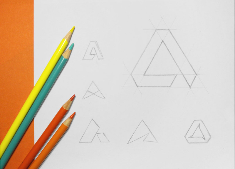
With logo design, there are once again no set rules, which can make the initial “experimental” process very hit-and-miss. After getting the weird, wonderful and woeful concepts out of the way (an inevitable but regrettable part of the process - I won’t show you those!), I began to try out some geometric designs, using the triangular shape of Asylum’s “A”. A couple of concepts in, it finally felt like we were getting somewhere!
I really liked a number of these designs, so I began to build on those – trying them in different layouts, adding colours, moving and resizing different parts until I was able to narrow it down to a concept that I was really happy with. It seemed like a big step, but there was still much to be done.
Fonts and dubious theories
When it comes to colours and shapes, it’s important to understand that there are a lot of clever theories about how they make people feel (that’s a blog post for another day). I now had a lovely and crisp, angular logo mark that I really liked, but although sharp and clinical design can be perfect for a lot of industries, I really wanted my logo to say something different. So what was I to do? Go back to the drawing board when I had already spent so long coming up with this design? Not necessarily...
It was time to pair our shiny new logo with a font.
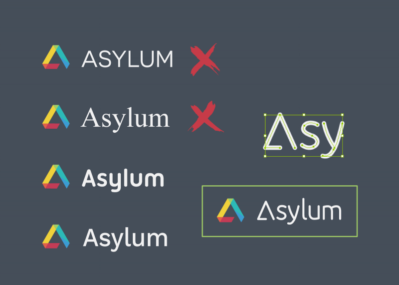
Choosing a font is actually quite a straightforward process which is mostly about elimination. To give the sharp logo mark the friendlier feel I was looking for, it was important to avoid sharp looking and ALL-CAPS typefaces. Serif fonts with their pointy edges weren’t going do the trick either, nor would a very decorative font, which would take away from the logo mark. It was down to the trusty sans-serif and rounded fonts.
Trying out a number of different fonts alongside the logo, there were a few nice options, but nothing that I was totally happy with, and in the end, I decided to compromise and make my own custom lettering by combining some of the best elements of the close contenders. What I came up with was round and friendly, but professional, and by mirroring the shape of the logo mark to create my new typeface’s “A”, it helped to tie both parts of the design together.
I don’t much like to use those fancy art college words, but it was all about the juxtaposition of two styles, and I didn’t need theories to tell me that it just worked.
Building the brand
Many months after I’d started, I finally had something tangible to work with, and for a lot of folks who come to me looking for a new logo, their story stops here. That may be a mistake however, because our final step – and it’s a big one – was to turn this name and logo into a brand.
In design and marketing, we often talk about a “brand”, and the common misconception is that our logo and our “brand” are the same thing. There is of course a part truth in this idea, because a company’s name and logo are usually the most recognisable part of their brand, but in fact the brand itself is the whole company persona. Our brand is in the language we use, the images and colours people see throughout our materials, the quality of our work, and the way we interact with our users and clients. It is in essence how other people see us, and although every public company has a brand, not every company considers what that brand might be saying about them!
The question that I wrestled with during the course of turning Fallen Design into Asylum was “what do I want the brand to say about this new company?”
Having talked with different people about the new company name, I knew that “Asylum” was a word with a lot of different connotations – not all of which were positive. Several people had talked about a dark and grungy feeling, so I wanted to use the branding to break that preconception in a really positive way. It needed to be bright, colourful, positive and a little bit fun. I already had a colourful logo, but in order to get the feeling right, I had to try some different colourful elements and imagery to add to the overall theme.
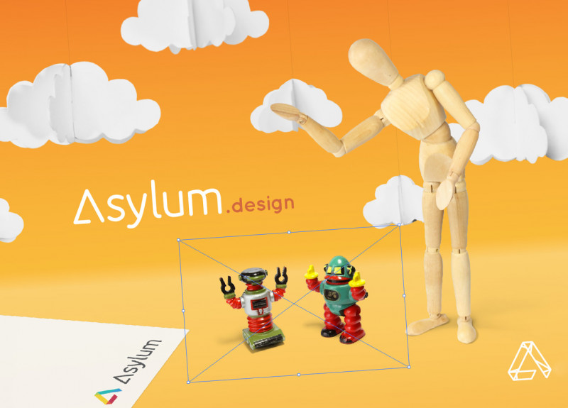
Version 1 of my expanded branding used a lot of colourful triangles (similar to the logo design), but although it was a good aesthetic, it wasn’t very friendly. The second iteration used isometric artwork – it could be a bit more fun, while sitting well alongside to our triangular theme, but this didn’t seem to do the trick for me either. For the third iteration, I went back to the drawing board and decided that characters would be a good thing to try... and eureka! After some sample photographs and a bit of fine editing, I had an idea that combined all the elements I wanted to convey. The puzzle was finally coming together in a really exciting way.
To make a much longer story short (is it too late for that?), I now took my new logo and my new colourful characters; I then mixed in some well-considered text, and there we had it. No longer just a name, not simply a logo, but a brand.
...or at least the beginning of one!
The End?
If you’re still reading at this stage, then I’m impressed by your perseverance.
The building of a strong brand may not be an experience for the faint-hearted or the impatient (it certainly tested mine), but the end result can be any company’s greatest tool or worst flaw, and it’s always worth doing well.
A great brand will often start with a great design, but that’s not where it ends – it certainly won’t for us here at Asylum. A brand is an ever-evolving entity that demands our patience, consideration and consistency, but if that sounds like a lot of hard work, then take heart – because with a design you love and a vision that you’re passionate about, I believe it can be a real pleasure.
So then, what was my final word on this great saga? Let’s try for a fortune cookie ending!
When it comes to a brand, we should never settle for anything less than excellence. Because excellence requires and brings out our very best ... and the world deserves to see that.
Until next time... you stay classy!